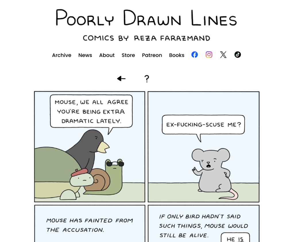
Introducing the newly redesigned poorlydrawnlines.com. After twelve or so years of the classic Poorly Drawn Lines website (which I loved and cherished), I felt like it was time for a refresh. The core functionality of the site is the same. But the new design features a more minimalist look that reflects my current art style with updated logos, new social media links, and a cleaner interface. It also has a cool new visual archive that will make searching for comics a bit easier. One feature that’s still to come: a site-wide search function to make browsing the archive even easier. Stay tuned for that.
How do you feel about the new design? Are there any other features you’d like to see? Let me know in the comments.
